MacBoyce Gaming
MacBoyce Gaming
The Deconstruction of Falling Stars
“How does this end?” - Captain John Sheridan
“In victory points!” - Kosh
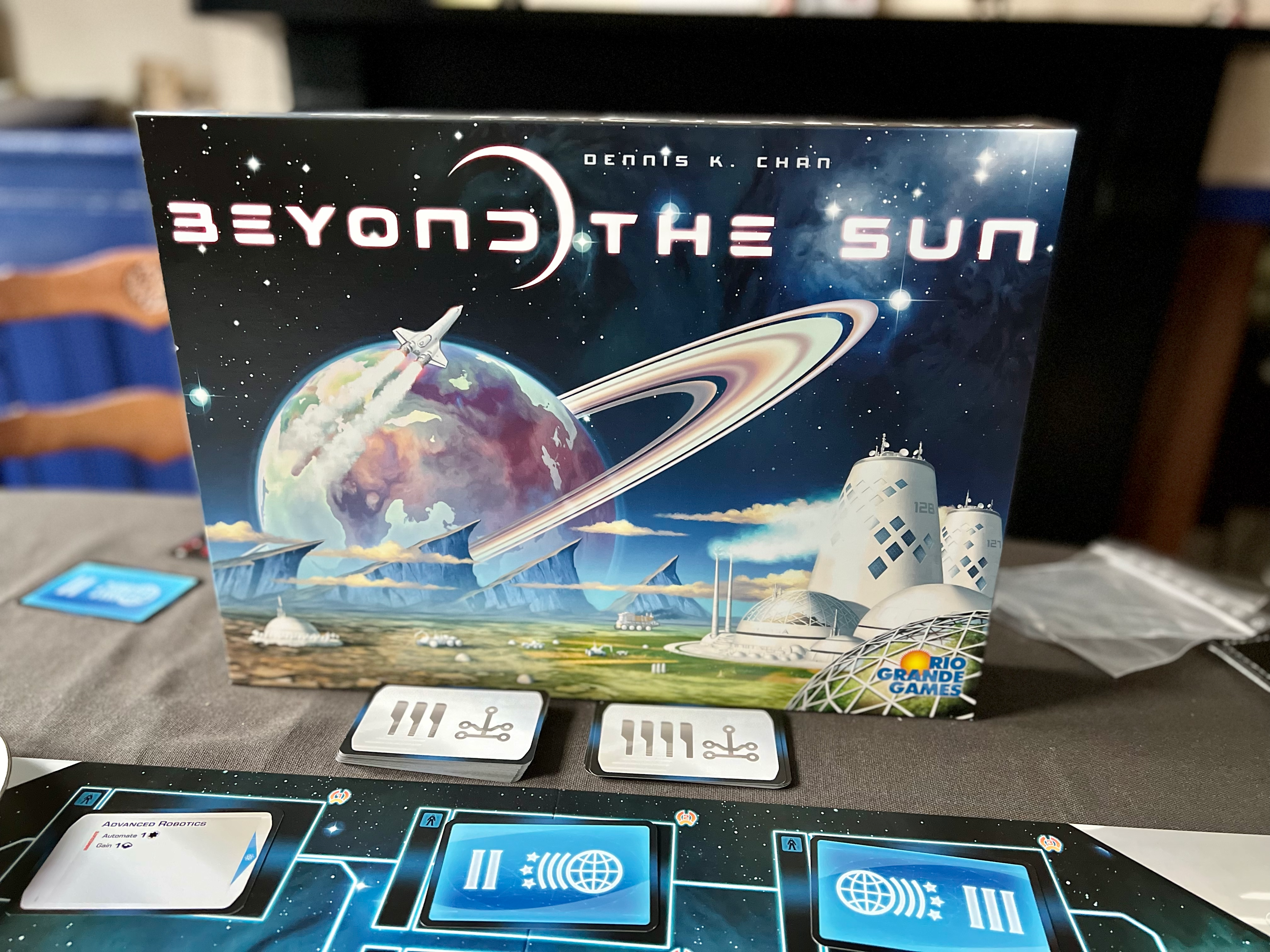
Beyond the Sun passed me by at first. I followed my usual process of board game purchasing, watching a “playthrough” video of the game if one is available. There happened to be on for Beyond the Sun, and the game looked boring. Visually and the gameplay, so I passed on it. It then went to sell out.
I did take a punt on another game from 2020 after I watched a playthrough - Anno 1800. That game was pretty much a hit after the first game (and I suspect everyone has the same first game issue - “How on Earth does this game ever end?”) What is the connection to Beyond the Sun I hear you ask, or the voice in my head asks. Whatever!
Both games rely on a central “Technology Tree”. In Anno 1800 it’s your typical type of thing from the era. Beer, cigars, glass, bicycles. In Beyond the Sun it is more ‘spacy’ type things. Both games also have you taking one main action, so in theory, turns will be quick, and both games don’t have a set number of rounds but end when a condition has been reached.
After that, they’re not that similar, but there is that core “tech tree”
This post isn’t a review of Beyond the Sun - or Anno 1800 - just some observations on both. At the time of writing this post, I have only played Beyond the Sun once yet have played Anno 1800 double-digit times.
I enjoyed the first play of Beyond the Sun, but some design elements put me off. They are:
The board is too big.
There’s too much whitespace and the two main boards take up too much space. Making reachability and visibility an issue.
Text size and whitespace use.
Some areas have suitable bold text, other areas have text that is too small to read from a reasonable distance, and is an accessibility issue. Yet there is too much whitespace. They could have used that whitespace to increase the size of the text.
The action selection spots are tiny.
Why, on a board so big, are the worker placement spots, and the wooden action pawns are tall and skinny? This makes seeing the choices as the game goes on even harder than it needs to be. Oh and good luck finding your white action pawn on a white board!
The player colours!
Blue and purple of a similar shade? Unusable for colourblind folks, so I probably won’t ever be playing this game with four players. White as a colour on a board that is mostly white and black?
Not good.
Now you may be thinking that this game isn’t any good. I think it has the potential to be good. My grumbles are mostly down to the design and the UI/UX. That kind of thing should not be an issue in 2020 when the game was released. There are no excuses for this. There really are no excuses for colourblind issues in a game or other accessibility issues like tiny text.
“Zathras does not want you being confused”
